Walk into a well-designed retail store and something happens almost immediately: you feel it before you can name it. The space feels inviting, the products seem more appealing, and before long, you’ve picked up something you hadn’t planned to. That’s not coincidence. Much of what draws customers in and keeps them browsing comes down to one quietly powerful tool: colour.
Colour psychology is the study of how hues influence human emotion, behaviour, and decision-making. In retail, it’s one of the most cost-effective levers a business can pull to shape the customer experience, from the moment someone walks past the shopfront to the second they reach the checkout counter. Whether you’re running a boutique along Orchard Road or a lifestyle concept store in Tiong Bahru, understanding how colour works can meaningfully change how customers feel in your space and how much they spend.
Why colour matters more than you think
Colour isn’t just decorative. Research consistently shows that visual appearance influences up to 90% of snap purchasing decisions, with colour being a primary driver. In Singapore’s competitive retail landscape, where foot traffic is fiercely contested and consumer expectations are high, the colours you choose signal who you are before a single word is spoken.
Shoppers make unconscious associations with colour remarkably quickly. A muted, neutral palette communicates premium quality and calm. Bright, saturated tones signal energy, affordability, or playfulness. These cues are deeply embedded in how people are wired to respond to visual stimuli.
The psychology behind common retail colours
Different colours do different jobs. Here’s a quick guide to how some of the most commonly used retail hues tend to perform:
- Red triggers urgency and excitement. It’s no accident that sale signs and clearance tags are almost universally red. Used sparingly, it draws the eye and prompts action, which is great for promotional zones or feature walls.
- Blue builds trust and calm. Banks, healthcare brands, and tech retailers lean on blue because it communicates reliability. For retail, it works well in spaces where customers need to feel reassured before making a considered purchase.
- Yellow and orange are energising and optimistic. They stimulate appetite and social interaction, which is why food and beverage retailers and lifestyle brands often incorporate them. In Singapore’s warm, sunny climate, these tones can feel naturally vibrant without being overwhelming.
- Green evokes health, nature, and sustainability. Wellness brands and sustainable fashion labels use green to reinforce their values through the environment itself.
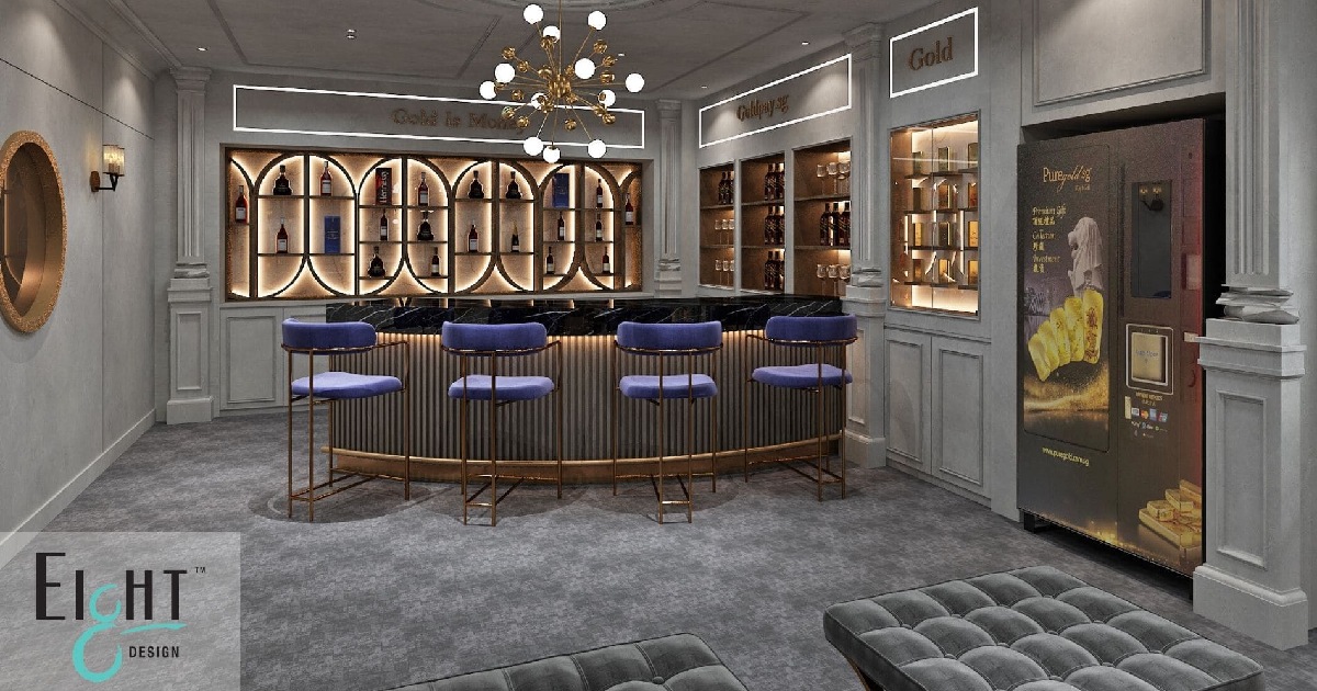
- Black and dark neutrals signal luxury and exclusivity. High-end retailers in areas like Marina Bay Sands or ION Orchard use deep, restrained palettes to position their products as aspirational.
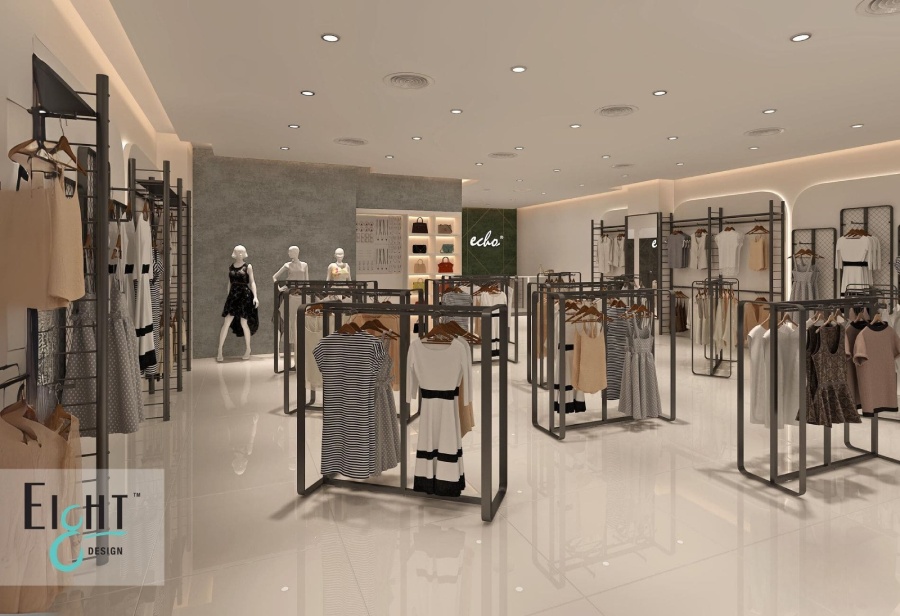
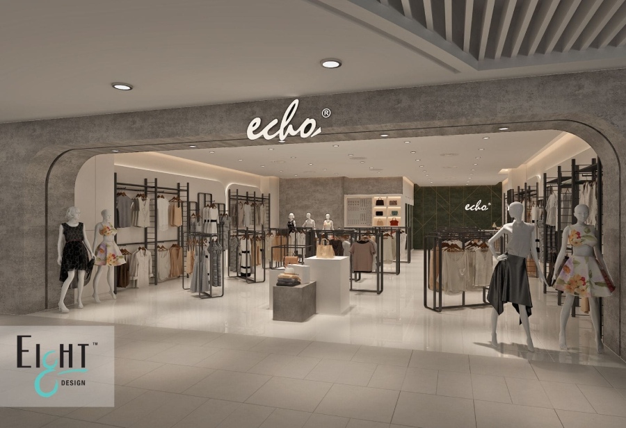
- White and light neutrals create space and clarity, which is ideal for minimalist or premium brands where the product itself needs to take centre stage.
Colour zoning: A smarter way to layout your store
One of the most practical applications of colour psychology in retail is zoning, using distinct colour schemes to guide customer movement through your store and subtly direct attention. Warmer colours near the entrance can energise and attract customers from the street. Cooler tones deeper in the store encourage slower browsing and longer dwell time. A bold accent colour around a feature display naturally draws the eye, creating a focal point that spotlights key products or promotions. When done well, colour zoning helps you create immersive retail spaces customers will love, without relying solely on signage or layout to do the heavy lifting.
Cultural nuance is key, especially in Singapore
Singapore’s multicultural makeup means colour choices carry cultural weight that a purely Western retail playbook won’t always account for.
- Red is broadly auspicious in Chinese culture and is commonly used during festive periods. Lunar New Year displays, for example, lean heavily on red and gold to signal celebration and prosperity.
- White, while clean and modern in many Western retail contexts, is associated with mourning in some Asian cultures. White-dominant spaces work well for premium aesthetics, but all-white environments can feel cold if not balanced thoughtfully.
- Gold and metallic accents carry aspirational and celebratory meaning across many Southeast Asian cultures, making them well-suited for gifting retailers, jewellers, or premium F&B concepts.
Lighting and colour work together
No conversation about retail colour is complete without addressing lighting because the two are inseparable. The same wall colour can read entirely differently under warm incandescent light versus cool LED lighting.
In Singapore, where air-conditioned interiors are the norm, natural light is often limited. This makes artificial lighting choices critical. Warm lighting tends to make reds, oranges, and yellows appear richer. Cool lighting suits blues, greens, and whites. Retailers investing in colour strategy should work alongside their interior designers to ensure the lighting plan supports and not undermines the palette they’ve chosen.
Small changes, real impact
You don’t need a full store renovation to start leveraging colour psychology. Even targeted updates can shift the feel of a space significantly:
- Repainting a feature wall in a strategically chosen accent colour
- Updating display furniture or shelving in a coordinated hue
- Introducing coloured lighting to create atmosphere in specific zones
- Using colour-coded signage to guide the customer journey
For retailers planning a more comprehensive refresh, these principles should be embedded from the very beginning of the design process, informing everything from floor finishes to fixtures.
Colour as a long-term brand asset
The most successful retail brands treat their in-store colour palette as an extension of their brand identity, not just an aesthetic choice, but a strategic one. Think of the unmistakable blue of IKEA, the forest greens of a wellness pharmacy, or the stark white interiors of Apple Stores. These aren’t accidents. They’re the result of deliberate decisions about how a brand wants customers to feel. In Singapore’s fast-moving retail scene, thoughtful design is one of the few ways to consistently differentiate. Colour, used intentionally, is one of the most powerful tools in that kit.
If you’re looking to redesign your retail space with colour psychology in mind, view our portfolio to see how Eight Design has helped retailers across Singapore create spaces that are both beautiful and commercially effective.