

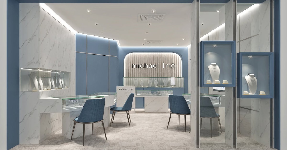
The way a retail space is laid out determines far more than where the shelves go. It shapes how long customers stay, which products they notice, how much they spend, and whether they leave with a positive enough impression to come back. Layout is one of the most powerful levers available to any retailer, and yet it is one that many shop owners give relatively little thought to until something clearly is not working.
Getting it right from the outset is considerably easier than retrofitting a space that was planned without the customer journey in mind. Whether you are fitting out a new retail unit or reconsidering an existing one, the principles below apply broadly across different retail categories and store sizes.
1. Understand how customers naturally move
Before making any layout decisions, it helps to understand a well-documented pattern in retail behaviour. The majority of shoppers entering a store turn right upon entry and tend to move in a counterclockwise direction through the space. This is not universal, but it is consistent enough to inform where high-priority products and promotions should be positioned.
The area immediately inside the entrance is sometimes called the decompression zone, the short stretch of space where customers are still adjusting to the new environment and are less likely to engage with products or signage. Placing key merchandise too close to the door means it will be walked past rather than noticed. Giving customers a moment to settle before the first significant display tends to produce better engagement with whatever comes next.
Interior design services with retail experience factor these behavioural patterns into the spatial planning process from the outset, rather than treating layout as a secondary consideration after the aesthetic decisions have been made.
2. Create a path, not just a floor plan
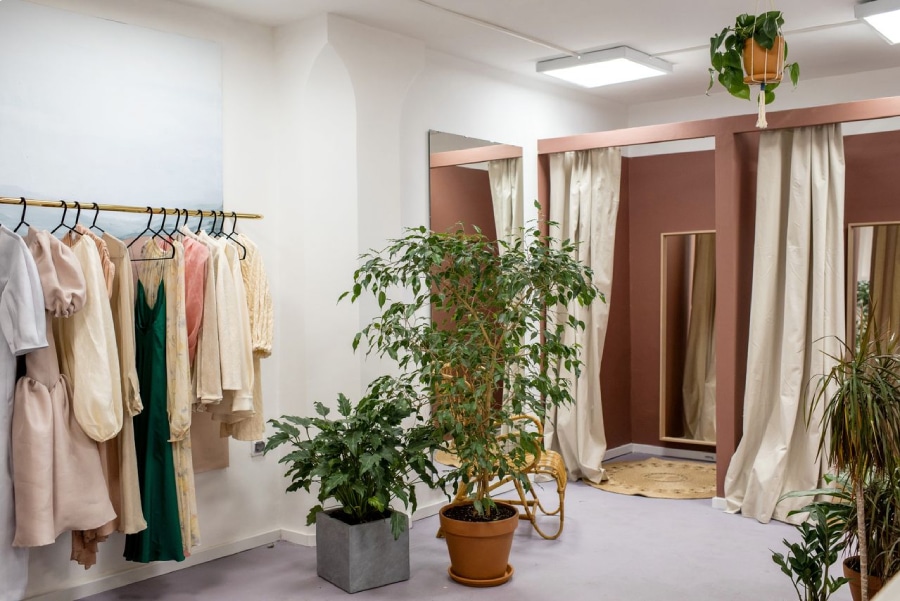
A retail layout that works well is one that guides customers through the space in a way that feels natural rather than forced. The goal is to create a logical path that moves shoppers through different product categories, exposes them to the breadth of what is available, and brings them to the checkout having seen as much of the store as possible.
Grid layouts, where shelving runs in parallel rows, work well for supermarkets and pharmacies where efficiency and product coverage are the priority. Loop or racetrack layouts, where a defined path circles the perimeter before connecting back to the entrance, suit fashion, homeware and lifestyle retail where discovery and browsing are part of the experience. Free-flow layouts with no fixed path give customers the most freedom and work well in boutique or premium environments where the pace is slower, and the products benefit from space around them.
The layout type should match the retail category and the shopping behaviour it is trying to encourage, and those two do not always align with what the floor plan makes easiest to execute.
3. Use sight lines to pull customers deeper into the store
One of the most effective techniques in retail layout design is the strategic use of sight lines, the visual paths a customer has from any given position in the store. A clear line of sight to a compelling display, a signature product or a visually striking fixture at the back of the store draws customers further in than they might otherwise venture.
This is why anchor products or hero displays are typically placed toward the rear of the space rather than near the entrance. Customers who walk to the back of a store will pass and potentially engage with everything in between. Those who find what they are looking for immediately near the door may leave without seeing the rest of the range.
4. Get the aisle widths right
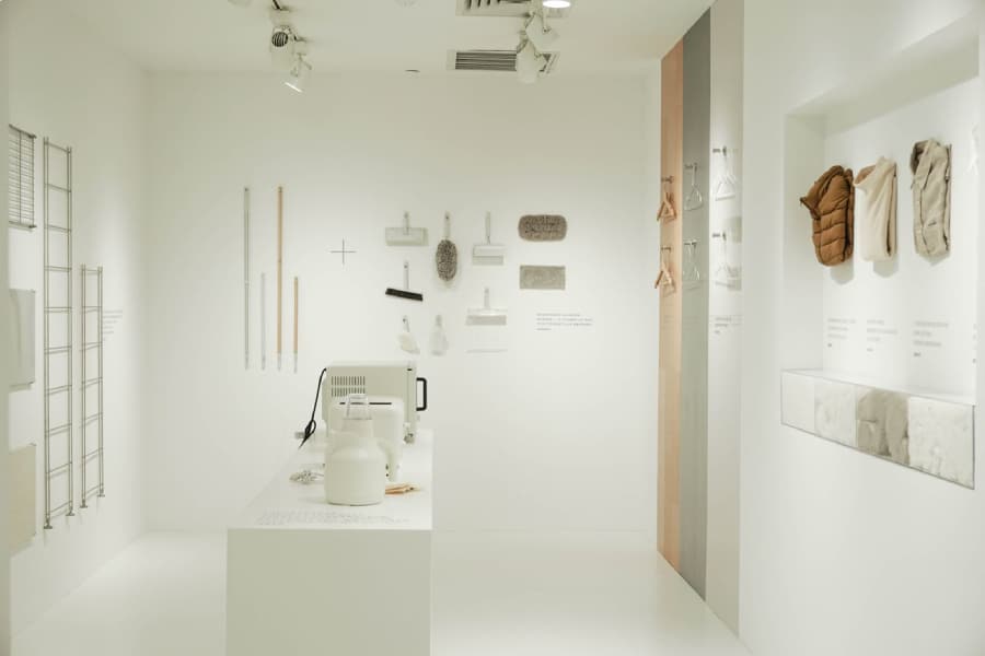
Aisle width has a direct effect on customer comfort and browsing behaviour. Aisles that are too narrow create congestion, which in a busy retail environment can make the space feel stressful and encourage customers to move through quickly rather than browse. Research on retail crowding consistently finds that perceived crowding reduces shopping enjoyment and time spent in store.
A minimum clear aisle width of 90 centimetres is generally recommended for retail environments, with wider aisles of 120 centimetres or more in areas where customers are likely to stop and browse for longer periods. The checkout area in particular benefits from generous space, as congestion near the exit creates a negative final impression that can overshadow an otherwise positive shopping experience.
Those planning a retail fit-out alongside a broader look at their commercial space may find it useful to read about smart interior design layouts for small retail shops, where many of these principles are explored in the context of more compact footprints.
5. Think about where customers pause
Every retail layout has natural pausing points, places where customers slow down, look around, or make decisions. These are often near category transitions, at the end of a display run, or wherever the path curves or changes direction. Identifying these points and placing high-margin or high-interest products there takes advantage of the attention customers are already giving to the space at that moment.
Impulse purchase displays work best near the checkout, where customers are in a decision-making mindset and have a moment to browse while waiting. Seasonal or promotional products perform well at the entrance to the main shopping path, where they catch customers at the beginning of their journey before attention is divided.
6. Lighting and fixtures shape the experience as much as the layout
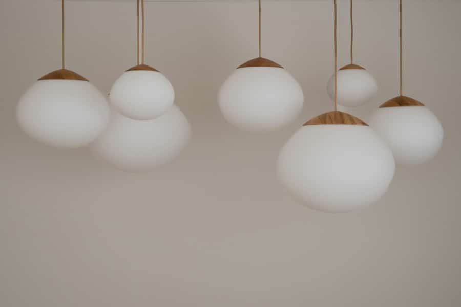
A layout plan on paper tells you where things go. What the customer actually experiences is shaped by how the space is lit, what the fixtures feel like, and how the overall environment reads when you walk into it. Warm, focused lighting on product displays draws the eye and makes merchandise look more appealing. Consistent, even lighting across the whole floor can make a space feel flat and make it harder for individual products to stand out.
Fixture height also affects the experience significantly. Lower fixtures in the centre of the floor maintain sight lines across the space and give the store a more open feel. Taller shelving is better suited to the perimeter where it can be used for volume storage without interrupting the customer’s view of the broader space.
A layout that works from day one
A retail layout that genuinely supports customer flow is the result of deliberate decisions made at every stage of the design process, from the initial floor plan through to fixture selection and lighting specification. Each decision either adds to or subtracts from the experience a customer has when they walk through the door, and those experiences accumulate into whether the store performs the way it should.
Get in touch with Eight Design to work with a team that approaches retail design from the customer experience outward. Our commercial portfolio covers retail, F&B and office environments, and we bring the same attention to spatial planning and finish quality to every project we take on. View our commercial portfolio to see what that looks like in practice.