

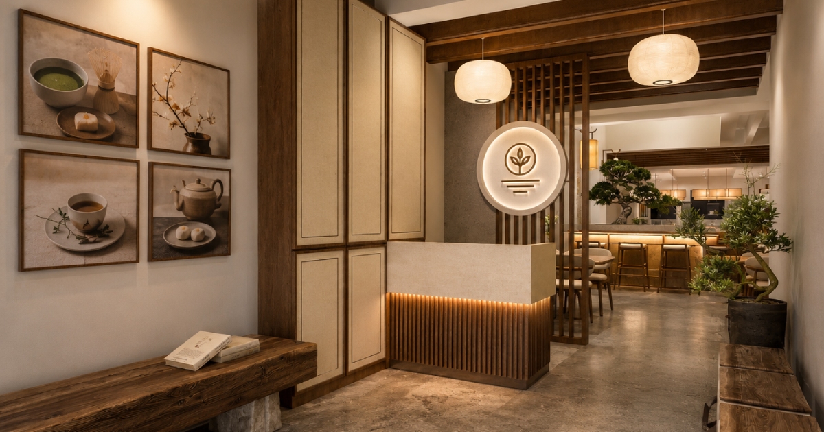
Singapore’s HDB heartland is home to a quiet but thriving retail ecosystem. The provision shops, hair salons, bakeries, and sundry stores tucked into the ground floors of HDB blocks have served neighbourhoods for decades, and many continue to do so with a loyal and consistent customer base. What these spaces share, beyond their community character, is a compact footprint that demands thoughtful planning if the layout is going to work properly.
Getting the layout right from the start saves money, reduces the need for costly changes down the road, and creates a shopping environment that encourages customers to stay longer and return more often. For small HDB ground floor retail shops, that planning process deserves considerably more attention than it typically receives.
Start with how customers move through the space
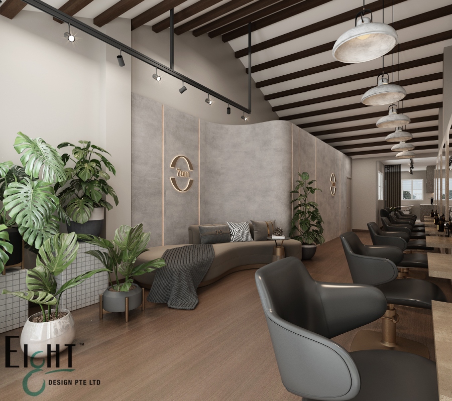
The single most important layout decision in any retail environment is the customer journey, meaning the path a shopper naturally takes from the moment they enter to the moment they leave. In a compact unit, this path needs to be intentional because there is very little room for error.
A common approach is to position the most eye-catching or high-margin products near the entrance, drawing customers in and setting the tone for the rest of the space. From there, the layout should guide movement naturally toward the back of the shop, where considered purchases or secondary products tend to sit. The checkout counter is best placed near the exit, so that the customer passes through the full retail experience before completing a transaction.
Aisle widths deserve particular attention in compact spaces. A minimum of 90cm between fixtures allows two people to pass comfortably, which is especially relevant during busier periods. Anything narrower tends to create congestion that discourages browsing and, in some cases, discourages entry altogether.
Vertical space is an underused asset
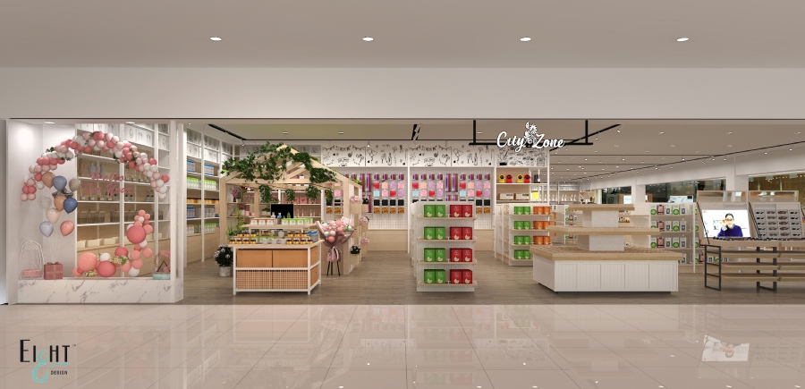
When floor space is limited, the instinct is often to fill every available surface with product. This creates visual clutter that overwhelms customers and makes the shop feel smaller than it actually is. A more effective approach is to think vertically, using wall-mounted shelving, pegboards, and tall display units to draw the eye upward and create a sense of height.
Wall-mounted displays also free up floor space, which can then be used for a feature display, a small seating area, or simply left open to improve the feeling of the space. Customers in a shop that feels open and navigable tend to spend more time browsing than those in one that feels cluttered and difficult to move through.
Interior design services that specialise in retail spaces understand this balance well, and the difference between a layout that maximises capacity and one that maximises customer experience is something that shows up directly in how a shop performs.
Lighting shapes how products are perceived
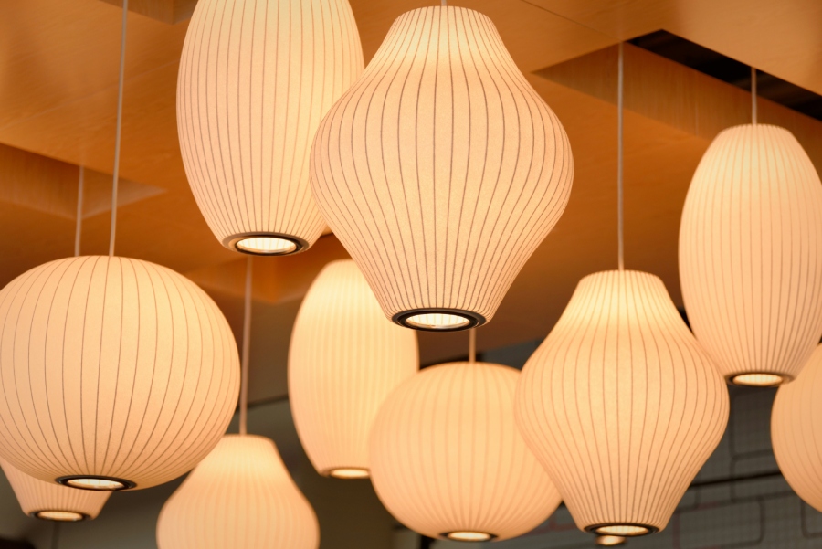
Lighting does two things simultaneously in a retail setting. It illuminates products and it creates atmosphere, and the best retail lighting achieves both without drawing attention to itself. The default overhead lighting in most units is rarely sufficient on its own, and supplementing it with targeted display lighting makes a meaningful difference to how products are perceived.
Track lighting mounted on the ceiling gives flexibility, as the direction of each light can be adjusted as the display changes. Spotlights trained on key products or focal points draw the eye naturally and create visual hierarchy within the space. For shops selling food, beauty products, or anything where colour and texture are part of the appeal, the colour temperature of the lighting has a direct effect on how appealing the product appears.
Warm white lighting in the 2700K to 3000K range tends to make spaces feel welcoming and products look their best. Cooler lighting can work well in more clinical or technical retail environments, but for most neighbourhood shops, warmth reads as more inviting and more in keeping with the character of the space.
Storage needs a dedicated place
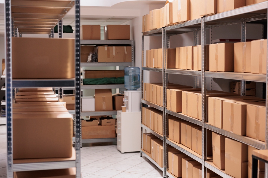
One of the most overlooked aspects of layout planning is back-of-house storage. The temptation in a smaller unit is to use every visible surface for display, leaving stock to accumulate wherever space allows. This creates a disorganised environment that is difficult to manage and visible to customers in ways that undermine the overall presentation of the shop.
Dedicating a clearly defined storage area, even a modest one partitioned off at the back, keeps stock organised and the retail floor looking intentional. Built-in storage solutions that make use of awkward corners or underutilised wall space can recover significant square footage that would otherwise be wasted. The retail floor then becomes easier to maintain and easier to rearrange when the display needs refreshing.
Retailers thinking about how their shop fits into the broader commercial landscape may also find it useful to read about retail colour psychology, since the decisions made around colour and display work hand in hand with layout choices.
Fixtures should work for the product category
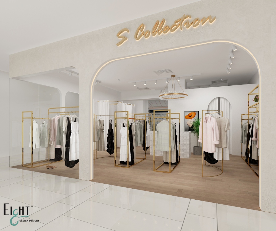
Different product categories have different display requirements, and the fixtures chosen should serve the product rather than the other way around. A shop selling clothing needs rails at the right height for browsing, with enough space between them for customers to flip through items without feeling rushed. A shop selling packaged food or sundry goods benefits from tiered shelving that allows multiple products to be visible at a glance. A beauty or wellness shop may prioritise a cleaner, more minimal display that allows individual products to stand out.
The key principle is that fixtures should be chosen after the product display logic has been established, not before. Starting with a generic set of shelving units and working backwards rarely produces a layout that serves either the product or the customer particularly well.
Make the most of every square metre
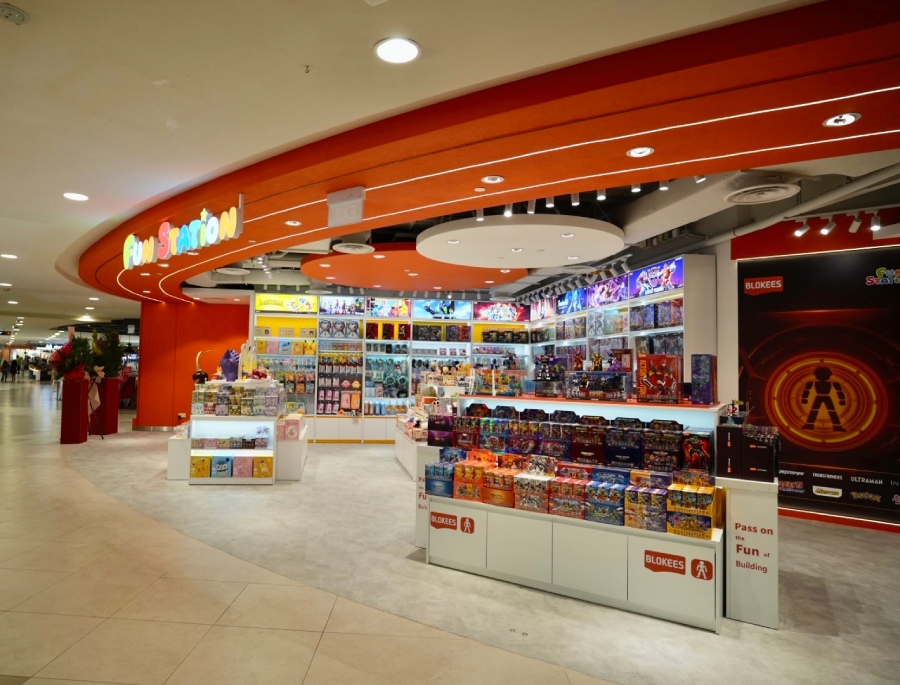
A well-designed small shop does not need to feel small. With a clear customer journey, thoughtful use of vertical space, considered lighting and purpose-built storage, even the most compact unit can offer a shopping experience that feels complete and professional.
If you are planning a retail renovation or starting from scratch in a new unit, view our commercial portfolio to see how Eight Design has helped businesses across Singapore make the most of their space.